The Button Is a Promise: Matching Labels to Outcomes
Button labels that match outcomes help people predict what happens next, distinguish saving from sending, and choose actions with confidence.
What will happen if you click this button? Button labels should answer that question before someone commits. A button marked “Save,” “Send,” or “Move” makes a different promise, even when all three actions involve the same information.
The useful test is simple: name the result a person can expect, not the interface’s internal task. That distinction helps people choose confidently, recover from interruptions, and spot when an action is not the one they intended.
What does a button promise?
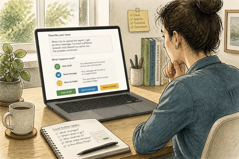
A button promises a particular change in the user’s situation. “Save draft” says the work will be retained for later. “Send message” says it will leave the draft state and go to someone. “Move to folder” says its location will change.
These verbs are not interchangeable. A person may welcome a saved draft, hesitate before sending it, and be surprised to find it moved. The button text should make that difference visible at the moment of choice.
Think of the label as a small contract between the interface and the user. The interface makes the action available; the words set an expectation. If the outcome differs, even a technically successful action can feel like a failure.
How do save, send, and move differ?
“Save” keeps information available without necessarily sharing it or changing where it lives. It can mean storing a draft, keeping edits, or retaining a preference. Add a clarifying word when the destination or state matters: “Save draft” is more informative than “Save” if the user might expect publication.
“Send” transfers information to a recipient or system. It usually implies that another person, team, or service can receive it. Use it when the action actually submits or transmits the content, not merely when it stores a local copy or advances to another screen.
“Move” changes location. It is useful for a file, task, or message that remains the same item but appears somewhere else. If the action makes a copy instead, “Copy” sets a different expectation. If it removes an item from its current view without a clear destination, describe that outcome rather than disguising it as a move.
Say you are designing a support form with a button that retains a user’s unsent description. Labeling it “Send” would imply that support will receive it. “Save draft” tells the user the text is being kept, while leaving clear that no request has been submitted.
What should a label say?
Use the shortest verb that names the consequential outcome, then add an object or destination when it removes ambiguity. “Archive invoice” is more concrete than “Continue” if the action stores the invoice out of the current list. “Share report with Maya” is clearer than “Done” when a named colleague will receive access.
Prefer labels that answer at least one of these questions:
- What changes? “Rename folder” identifies the affected item and change.
- Where does it go? “Move to Projects” names the destination.
- Who receives it? “Send to accounting” identifies the recipient group.
- What state remains? “Save as draft” distinguishes an unfinished item from a submitted one.
- Is the effect final? “Delete account” is more candid than a vague “Confirm” when deletion is the action.
Not every button needs a sentence. Keep the wording concise, but do not remove the word that distinguishes one meaningful outcome from another. A short label is useful only if the person can predict what follows.
When is “Continue” too vague?
“Continue” works when it means exactly what it says: move to the next stage, with no hidden submission, charge, sharing, or irreversible change. It is weak when it conceals the decision the user is making. If a form is about to be sent, “Submit request” gives better information than “Continue.”
Generic labels also create problems in repeated controls. A page full of “Edit” buttons leaves people guessing which item each one changes, especially when assistive technology presents controls outside their visual context. “Edit billing address” or an accessible name that identifies the item can make the choice clearer.
Use a specific label when the next action affects another person, changes access, changes location, or closes off an easy return. A general label may be adequate for a low-stakes transition, but it should not hide a meaningful consequence.
How should feedback confirm the action?
After the click, feedback should report the result in language that matches the button’s promise. If someone chose “Save draft,” say the draft was saved. If they chose “Move to Projects,” identify the new location. A generic “Success” confirms little and may leave the person wondering what succeeded.
Timing matters too. A button can show a brief in-progress state when an action takes time, then a clear outcome when it finishes. Avoid changing its label to something that implies completion before the system has completed the action. If the action fails, explain whether the information remains available and what the person can try next.
Feedback should not contradict the original label. If “Save” actually submits a form, a later confirmation cannot repair the misleading promise at the point of decision. Make the label and result tell the same story.
Which label fits the situation?
Should a draft button say “Save” or “Submit”?
Use “Save” when the content remains a draft for later work, and use “Submit” when it is delivered for review or processing. Add “draft” or the destination if the surrounding context does not make that state obvious.
Is “Done” a useful button label?
“Done” can fit when the user is closing or finishing a small task and the outcome is already clear. Replace it when the button also sends, deletes, publishes, or moves information, since those actions deserve their own verbs.
Should the button describe the action or the next page?
Describe the action when it changes information or creates a commitment, such as “Send invitation.” Describe the next page only for a straightforward transition, such as “View results,” where no hidden consequence is involved.
What if one button triggers several outcomes?
Name the outcome that matters most to the user, and make other consequential effects clear before the click. If the combined action is difficult to explain in a short label, separate the choices rather than squeezing several promises into one button.
How can you review labels?
Read each button aloud with the sentence “When I choose this, I expect…” Then compare that expectation with the actual result. Check the control in its real context: nearby text may clarify a destination, while a label repeated across a page may not identify which item it affects.
For a compact review, ask:
- Does the verb describe what the user will observe?
- Could someone confuse saving with sending, or moving with copying?
- Is the recipient, destination, or resulting state clear where it matters?
- Does the confirmation use the same terms as the button?
- Would the label still make sense when encountered without nearby visual context?
Button labels that match outcomes turn a click from a guess into an informed choice. Keep the promise precise, then make the interface’s response confirm that the expected change really took place.