Error Messages That Blame the Reader
Error messages that blame the reader can stall a task. Learn to describe the problem honestly, offer a usable next step, and make recovery easier.
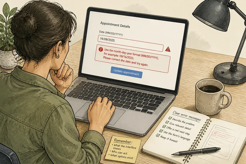
What should an error message say when a website rejects a form? Error messages that blame the reader make a fixable snag feel like a personal failure. “You entered invalid information” points at the person, even when the form’s label or format rule caused the confusion. A clearer message names what happened and shows what can happen next.
Good feedback stays within what the interface knows. It distinguishes a correctable entry from a service problem, then offers an action the person can actually take. The wording should not guess at a cause or promise that a retry will work.
Three response styles
Imagine a sign-up form rejects a password, and the form’s stated rule requires a letter and a number. These versions report the same obstacle differently:
- Blaming: “You entered the wrong password.” This assigns fault without explaining the rule.
- Neutral: “Password not accepted.” This reports the outcome but leaves the reason unclear.
- Guiding: “Use a password with a letter and a number, then try again.” This gives a relevant correction because the form has stated that requirement.
If the interface cannot identify why the password was rejected, it should not invent a reason. A neutral status is more honest than a confident but unsupported instruction.
Match words to knowledge
Blame-focused phrases such as “You failed to” and “You forgot to” turn a state of the form into a judgment about a person. That can feel especially unfair when a required field is not clearly marked or a format rule appears only after submission. Describe the condition instead: “The confirmation codes don’t match” tells the person what to check without guessing how the mismatch happened.
Neutral wording works when the cause is uncertain or the service is responsible. “Message not sent” or “The server could not complete your request” reports the result without assigning fault. If a useful action is available, add it: “Your changes were not saved. Try saving again.”
A bare status can still leave someone stuck. “Invalid input” does not identify the field, and “Payment declined” may not reveal what the person can do. Include the most specific detail the interface can confirm; avoid naming a cause it cannot verify.
Offer a real next move
Guidance is useful when the interface knows what needs attention and provides a safe way to address it. State the condition, give the relevant detail, and offer an available action. For example: “This file can’t be attached. Choose a supported file type or send a link instead.” Use that wording only if those options are genuinely available.
“Please try again” is suitable when retrying is a sensible option, but it is not a cure-all. A person who needs to correct a date format will not benefit from repeating the same submission. If the service is unavailable, say so and point to a real alternative, such as contacting the office.
Choose the right message
- Check what the interface knows. If it can identify a specific condition, name it; if not, report the outcome without guessing.
- Check who can act. If the person can correct a field, state the relevant requirement; if the service must resolve the issue, say that instead of asking for another identical attempt.
- Check the available options. If retrying or editing is possible, name that action; if not, explain the limit and point to an available support route.
- Check the form’s own language. If the field is called “postal code,” use that term in the message; if a different term marks a real distinction, explain it.
- Check how the error is shown. If color highlights the problem, pair it with text; if the message is not understandable without color, revise the text and visual cue.
- Check what happens to entered information. If the interface can safely preserve it, keep it available for correction; if it cannot, explain what the person may need to enter again.
Say you are editing an appointment form, and the interface accepts dates in month-day-year order. You enter “14/09/2025,” and the form rejects it. First, check whether the field identifies the accepted format. If it does, change the value to “09/14/2025” and submit again; the decision is to correct the format, not to blame the person. If the date field instead works but the appointment service is unavailable, changing the date is the wrong action. The message should report that the service cannot check appointments and give an available route, such as trying later or contacting the office.
For an editorial pass, read each message beside its field or status indicator. Ask whether it identifies a known problem, gives an accurate instruction, and offers an action that exists. Remove blame unless responsibility is both clear and relevant.
How should error messages read?
Should an error message apologize?
An apology can acknowledge a service interruption, but it should not replace useful information. “Sorry, your changes didn’t save. Try saving again” reports the result and offers an action.
How specific should an error message be?
Name the affected field or condition when the interface can confirm it. Include a requirement only when it matches the form’s actual instructions.
What if the cause is unknown?
Describe the outcome without guessing: “We couldn’t load your results” does not blame a connection or a person. Add a retry or support option only if it is available and relevant.
Is using “you” always blaming?
No. “You can edit this address” points to an action, while “You entered the wrong address” assigns fault. Focus on what happened and what can be done.
Make recovery visible
Put a field-specific message near the affected field, and make the relevant control easy to find. Keep information someone has already entered when the interface can do so safely. For a service-wide failure, place the message where it is noticeable without hiding the task.
Use text as well as color to show an error. A message should remain understandable to someone using a screen reader or viewing the page without color. Most of all, make sure its wording matches the form: if the message describes a rule the interface does not show, the person has to guess which instruction to trust.
Error messages that blame the reader obscure the useful distinction between a correctable entry and a service problem. Describe what the interface knows, then name a real next move. That keeps the message honest and makes the route forward easier to see.