One Long Page or Several Short Ones?
Choose one long page or several short ones by spotting where readers lose their place, then shape the layout to make key information easier to find.
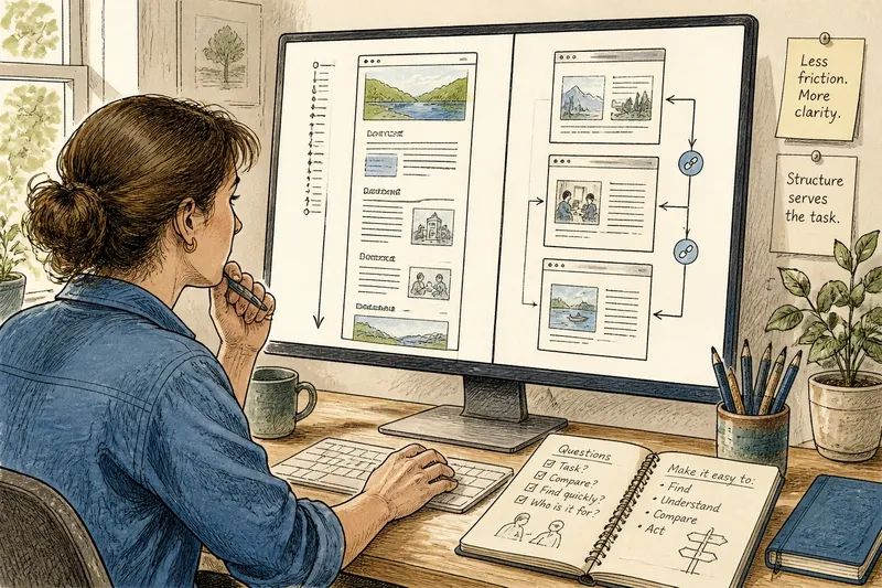
Should this information live on one long page or several short ones? For a website layout, the answer depends on where readers lose their place, miss a section, or struggle to compare details. The useful question is not how long the page looks, but whether its structure helps people follow the task they came to do.
A continuous page keeps related material in one scrolling space. Divided pages give each part a separate destination, usually with links or navigation between them. Either can work. The right choice depends on the relationship between the content and the route readers need to take through it.
Find the friction
Describe the problem before debating page length. “The page is too long” might mean readers cannot locate a particular detail. It might mean the answer sits beneath background they do not need. Or readers may need to compare two sections and keep losing one while moving to the other.
Those problems call for different responses. Splitting a page can make a section easier to locate, but it adds a transition. Keeping everything together can support comparison, but it can make landmarks harder to spot. Start with the task that has become awkward.
Consider how the content relates. Does each part depend on what came before? Would readers want to compare sections or revisit one while reading another? Strong connections often favor continuity. Distinct tasks or audiences may be easier to serve with separate pages.
Strengthen page landmarks
A long page can feel disorienting when its sections look alike. Readers may pass the heading they need, forget where they are, or reach the bottom without seeing how the pieces fit together. The cause may be weak hierarchy rather than length: headings blend into body text, topics shift without warning, or there is no easy route back to a useful section.
Make the structure visible before dividing the page. Use specific headings, consistent heading levels, and a linked contents list when readers may want to jump to a section. On a page with a sticky header, check that a jump link does not hide the destination heading behind it.
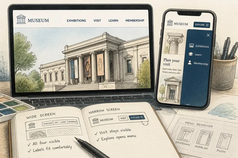
Check the layout on a narrow screen, too. A contents panel that sits neatly beside a desktop article may push the content far down on a phone. A compact contents link or simple list near the beginning may work better. The aim is to help readers establish their position, not add another layer of furniture.
If the page still feels like a stack of unrelated destinations after its hierarchy is clear, division may help. Make each boundary reflect a real change in task or subject. Do not leave a heading at the bottom of one page and its explanation on another.
Keep page transitions clear
Separate pages can be easy to scan yet leave readers unsure where to go next. A page may end just as a new subject begins, without explaining the connection. Or a link may use a broad label that gives little clue about its destination. The problem is often a broken connection, not a shortage of content.
Add a brief transition explaining why the next part matters. Use page titles and link labels that distinguish sections, then provide a visible route forward and back. Readers should be able to tell whether the next page continues a sequence, offers a related option, or starts a separate task.
Check the browser’s back button as part of the route. If readers must return to a hub just to continue a straightforward sequence, the layout may impose extra work. A clear next-and-previous route can help with a linear process. For independent topics, an organized index may be more useful than a forced sequence.
Bring comparisons together
Readers often need to compare conditions, choices, or supporting details. Splitting those pieces across pages makes comparison harder because readers must remember one detail while opening another. A continuous page can help when sections are close enough to scan together and their labels make the comparison clear.
But a single stream is not always better. If two subjects are far apart, readers may spend more effort scrolling and finding their place than comparing the content. A compact comparison table, linked section headings, or parallel summaries can bring related information closer without flattening the whole site into one page.
Say a community arts center has a page about room rentals, equipment, and booking rules. Imagine visitors keep scrolling between the equipment details and the rules to learn what applies to a booking. The center groups those details in a clearly labeled comparison section and links to it from the booking information. Readers can then check the relevant details in one place, while unrelated topics remain where they are.
Put useful answers first
A long page can make a simple answer feel distant if it opens with background most visitors do not need. Several short pages can create the same problem if readers must open multiple destinations before reaching the detail that resolves their question. In both cases, information order is the issue.
Put useful orientation near the beginning: what the page covers, who it serves, and where the important sections are. Place background where it supports a decision rather than making every reader pass through it. On divided pages, make link destinations clear so readers can choose the relevant part without opening every page in turn.
Do not split content solely because it looks long in an editor. Headings, lists, and short paragraphs can make a continuous page readable. A short page can still confuse if its purpose is unclear. Judge the layout by how readers locate and connect information, not by the number of screens it occupies.
Choose a page structure?
When should a long page be split?
Split it when sections serve distinct tasks or subjects and readers need a clear destination for each. Give every resulting page enough context to make sense when someone arrives directly from search or a shared link.
Does a long page need a contents list?
Not always; a short, clearly structured page may be easier to read without one. Add a contents list when readers are likely to seek particular sections or move among them, and check that it works on small screens.
When is a continuous page better?
Keep related material together when readers benefit from following an explanation in sequence or comparing nearby sections. Clear headings and a useful contents route can make the page easier to navigate.
How can I tell whether a page boundary helps?
Ask what meaningful change it represents: a new task, a separate audience, or a distinct subject. If the only reason is that the page looks long, improve its structure first and reconsider the split.
Make a focused change
When a layout feels awkward, avoid moving all the content at once. Identify the clearest sign of friction: a missed section, a confusing transition, a hard-to-follow comparison, or an answer buried beneath background. Then make the smallest relevant change, such as sharpening headings, adding a contents route, bringing related details together, or dividing genuinely separate topics.
One long page or several short ones is a decision about how readers keep their place and connect ideas. Before publishing a change, follow the route as a visitor would: arrive from search, find a specific section, move to a related detail, and return to the original point. If that route stays clear, the layout is doing more than looking tidy.