Before the Menu Icon: How Screen Space Shaped Digital Navigation
Learn how screen space shapes digital navigation, from visible links and tabs to compact menus, and choose a pattern that keeps important destinations easy to find.
Why do some websites show every main link while others tuck them behind a menu icon? Digital navigation is a screen-space decision: visible links reveal destinations at a glance, while compact menus reserve more room for the page.
Each pattern makes a different tradeoff. The useful question is not which one replaced another, but which choices visitors need to see before they act.
Visible links
A row across the top, a side column, or a short list near a page title can put destinations in plain view. Visitors can scan the labels without opening another control, and the arrangement can suggest how sections relate to one another.
That clarity takes room. More links can crowd a header, wrap labels onto extra lines, or compete with the page title. On a narrow screen, a layout that feels calm on a laptop may become cramped.
Visible navigation suits a small set of important destinations when the labels fit comfortably. If the row grows too long, hiding links is not the only option: a team can also shorten labels, group related destinations, or move secondary links elsewhere.
Tabs and bottom bars
Tabs frame a compact group of related sections. A visible selected state can show where someone is, while the other labels offer direct routes to nearby areas. Too many tabs or long labels weaken that clarity.
A bottom tab bar places a small set of destinations near the bottom edge of a phone. It can make frequent movement between central areas straightforward, but it is a poor place to squeeze an entire site map. Use it for a few stable destinations, not as a miniature version of every page.
Tabs and navigation menus are not interchangeable. Tabs typically expose a closely related set and mark the selected section; a menu can contain a broader set of destinations, often grouped under labels.
Compact menus
A compact menu preserves header space by showing a control instead of the full list. The familiar three-line icon may be recognizable, but it does not tell visitors which destinations are inside. Pair it with a clear accessible name, make the open state apparent, and give people a predictable way to close it.
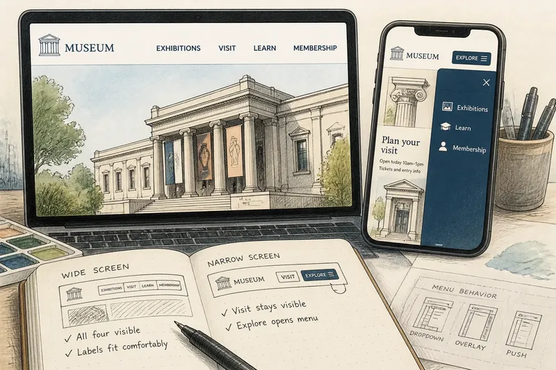
The menu’s behavior should also make its relationship to the page clear. It might open below the header, cover the page, or push content aside. Whichever approach the interface uses, keep the current location identifiable and make destination labels specific.
A collapsed menu reduces clutter, but adds an action before someone can inspect the choices. That cost matters most when visitors need to compare destinations or reach an essential section quickly.
Choosing digital navigation
Start with the destinations, not the icon. Decide which links deserve immediate visibility, then check whether their labels fit in the space available. Do not shrink type until it becomes hard to read simply to preserve a crowded row.
- Count primary destinations: If the main set is short and each label fits, keep the links visible; if it crowds the header, group secondary destinations or use a menu.
- Check label fit: If labels wrap, truncate, or run together at a narrow width, revise the wording or switch layouts; if they remain clear, retain the visible arrangement.
- Inspect the selected state: If the current tab or link is hard to distinguish, strengthen its visual cue; if it is clear, keep the existing treatment.
- Open the compact menu: If the control’s purpose or open state is unclear, add a name and a visible state change; if both are clear, check the menu’s labels next.
- Review destination groups: If visitors must guess what a category contains, rename it or expose its links; if the label accurately describes the contents, keep the grouping.
- Check the layout at a realistic text size: If controls collide or labels become difficult to read, simplify or rearrange them; if the layout stays legible, test the next screen size.
Say you are designing a museum website with four main destinations: Exhibitions, Visit, Learn, and Membership. On a wide screen, all four labels fit in the header; on a narrow phone screen, they wrap and press against the museum’s title. You keep “Visit” visible because it covers practical arrival information, move the other three links into a menu labeled “Explore,” and make the open state visibly distinct. The resulting tradeoff is clear: visitors can spot Visit immediately, while the other sections require an extra tap but no longer crowd the header.
Common navigation questions
Why do websites hide navigation?
A compact menu gives a narrow header more room for the page title and content. Visitors must open it before they can inspect the full list of destinations.
Are tabs the same as a menu?
No. Tabs usually present a small, related set of sections and show the selected one. A menu can contain a broader set of destinations, often organized into groups.
When should links stay visible?
Keep links visible when the destinations are important, the labels are easy to scan, and the layout has room for them. If the row becomes crowded, change the grouping or arrangement rather than forcing a tight fit.
Keep choices legible
Digital navigation works best when its layout matches the choices people need to make. For your own digital navigation, check whether someone can spot the essential destination without an extra tap, then confirm that every hidden option is easy to find once the menu opens.